
Learning Photography Course — 7. Composition and Seeing
Module 7 of the Learning Photography Course. Every module before this one was about machinery. This one has almost no machinery in it, and it decides whether any of the rest was worth carrying.
Composition is not decoration applied to a photograph. It is the arrangement of what is inside a rectangle and — just as much — the decision about what is left outside it. That second half is the part beginners skip: raising a camera is choosing what to EXCLUDE, because everything else in the world is also in front of you. So the first compositional decision, before framing and before the thirds, is where the edge goes. One step forward and a bin leaves the frame. Neither of those is a technique; both are the entire job.
Then the warning that governs the module: the rules of composition are descriptions, not instructions. They were arrived at backwards — somebody looked at pictures that worked and wrote down what they had in common. That is a useful shortcut to what has often worked before. It is not a law, and a picture does not become good by obeying it.
The rule of thirds, and what it is actually describing. Its usual attribution to John Thomas Smith in 1797 — four decades before photography — given as the received account rather than as something this course has verified in the original.
And the golden ratio, handled honestly. The number is real and mathematically interesting; the historical claims about the Parthenon, the Great Pyramid and Leonardo are contested, and contested more sharply than the way they are usually taught would suggest. George Markowsky's 1992 paper for the Mathematical Association of America goes through eight of these claims, and his central objection travels far beyond this argument: a building offers a very large number of things to measure, and somebody looking for a particular ratio will find it somewhere. His critics do not accept that, and the module says so. Even Fechner's preference experiments of the 1860s are reported two incompatible ways, which is a reason to be careful rather than a reason to pick the version you prefer.
Centring, rescued from the same received wisdom. Line, and why a leading line leads — attention follows continuity, and a line points whether or not you chose where. Horizon placement. Converging verticals, which are perspective doing exactly what it does rather than a fault in the lens.
Pattern, and why a perfect one is decorative: it has nothing to resolve. Negative space, and the test of whether the emptiness is doing work. Depth, built from overlap, relative scale and atmospheric haze — which is why a photograph taken on a very clear day can look flatter than one taken in slight haze.
Visual weight, in measured order: faces first and not close, then contrast, then saturation, then sharpness, and finally size — which matters less than people assume. Colour as a compositional element rather than a property of the subject, and why restricting the palette is subtractive and usually done with your feet rather than in editing.
Then simplifying: get closer means move your feet, not use a longer lens; change height, which is the cheapest and least used control in photography; and wait, which is barely ever taught as a compositional technique and is how a large fraction of good photographs are actually made.
And finally the distinction the whole module is for: a photograph OF a thing, and a photograph ABOUT something.
Educational documentary. Not financial or investment advice.
In these topics
Video notes
1. 1 What composition is for

Every module before this one has been about machinery — what a lens does, what a shutter does, what light does. This one has almost no machinery in it, and it is the module that decides whether any of the rest was worth carrying.
Composition is not decoration applied to a photograph. It is the arrangement of what is inside a rectangle, and — just as much — the decision about what is left outside it.
That second half is the part beginners skip. A photograph is defined as precisely by its edges as by its subject. When you raise a camera you are not choosing what to photograph; you are choosing what to exclude, because everything else in the world is also in front of you and you are cutting a rectangle out of it.
So the first compositional decision, before framing, before the thirds, before anything, is: where does the edge go? Take one step forward and a distracting bin leaves the frame. Crouch and a pylon disappears behind a wall. Neither of those is a technique. Both are the entire job.
And now the warning that governs the rest of this module.
The rules of composition are descriptions, not instructions.
They were arrived at backwards. Somebody looked at a large number of pictures that worked, noticed that many of them had features in common, and wrote the features down. That is a useful thing to have done — it is a shortcut to what has often worked before. It is not a law, it was never derived from anything, and a picture does not become good by obeying it.
Which is why this module will give you the conventions and then tell you, in each case, what they are actually describing. If you understand why a convention tends to work, you will know when to ignore it, and knowing when to ignore it is the only reason to learn it at all.
2. 2 Dividing the frame

The best-known convention in photography is the rule of thirds: divide the frame into three parts horizontally and three vertically, and place the things that matter on those lines or where they cross.
It is older than photography. The phrase is generally attributed to John Thomas Smith, in a book on rural scenery published in seventeen ninety-seven — four decades before the first photograph — and it was advice for painters. Treat that attribution as the received account rather than as something this course has verified in the original.
What is the convention actually describing? Two things. It puts the subject off centre, which leaves room in the frame for the subject to relate to something else. And it puts it at a position that is neither centre nor edge, which is stable without being static.
Now the one that needs care: the golden ratio.
You will be told that a ratio of about one to one point six one eight underlies the Parthenon, the Great Pyramid and Leonardo's paintings, and that photographs composed on it are more pleasing because of some deep property of human perception.
The number is real and mathematically interesting. The historical claims are contested — and they are contested much more sharply than the way they are usually taught would suggest.
The best-known challenge is George Markowsky's paper Misconceptions about the Golden Ratio, published by the Mathematical Association of America in nineteen ninety-two, which goes through eight of these claims one at a time.
His central objection is the one worth carrying away, because it applies far beyond this argument. A building or a painting offers a very large number of things to measure — height to width, height to column spacing, one part to another — and a person who is looking for a particular ratio will find it somewhere. The Parthenon has no single rectangle in it, so what you measure decides what you get, which is why different authors get different answers from the same building.
It is only fair to say that his critics do not accept this. On the Great Pyramid, Markowsky is reported to have calculated a ratio within nought point nought nine per cent of the golden ratio and to have rejected it anyway, because the claim that it was intended rests on a Greek text written two thousand years afterwards. Rejecting a match that close on textual grounds is a judgement rather than a measurement, and his critics say so.
Even the experimental evidence is disputed at the level of what it found. Fechner's preference tests in the eighteen sixties are usually quoted as showing that most people prefer the golden rectangle. Some accounts say about three-quarters of subjects chose one of three middle-proportion shapes, which would be a preference for "not very long and not very square" rather than for one ratio. Others say the preference landed on the golden rectangle itself. Two descriptions of the same experiment, and they do not agree — which is a reason to be careful rather than a reason to pick the one you prefer.
So: compose on the golden ratio if you like what it does. Just do not do it because of the Parthenon, because that part is an argument rather than a fact.
Centring deserves rescuing from all this. A centred subject is often called a beginner's mistake, and it is frequently the strongest choice available. Symmetry wants the centre. Confrontation wants the centre — a portrait looking straight down the lens is more direct centred than placed on a third. Formality wants the centre. The convention says off-centre because off-centre is more often useful, not because centre is wrong.
And then there is breaking the division on purpose: putting the subject hard against an edge, or in a corner, or letting it run out of the frame. That produces tension, and tension is a legitimate thing to want. The only failure is doing it by accident.
3. 3 Line
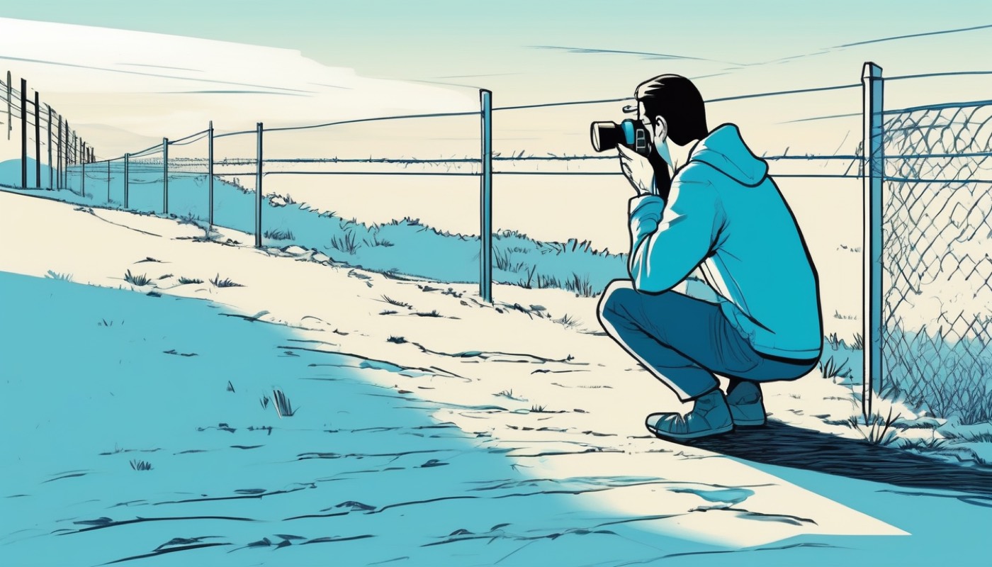
A line in a photograph is anything continuous enough for attention to follow: a road, a wall, a shadow, a shoreline, a row of anything.
Leading lines work because attention follows continuity. Put a fence running from the bottom corner towards your subject and the viewer arrives at the subject by way of the fence. It is not that lines have power; it is that an unbroken form is easier to follow than to leave.
The failure mode is a line that leads somewhere you did not intend — out of the frame, or to the brightest empty corner. A leading line points whether or not you chose where.
Diagonals carry more energy than horizontals or verticals, and the reason is comparative: a horizontal sits parallel to the frame edge and rests against it, while a diagonal crosses the frame and is at odds with it. Curves, and the S-curve in particular, do the same work more slowly — the eye traverses a curve rather than travelling along it, which is why a winding river makes a picture feel unhurried.
Horizon placement is where the thirds convention earns its keep. A horizon across the middle divides the picture into two equal claims and usually makes neither. Put it low and the picture is about the sky. Put it high and it is about the land. Both are decisions; the middle is usually an absence of one.
Converging verticals are the one place where a line is doing something you may not want. Point a camera upwards at a building and the vertical edges converge, because they are further from the camera at the top than at the bottom. That is not distortion or a fault in the lens — it is perspective doing exactly what it does, and module five's tilt-shift chapter explains how to avoid it.
Whether to correct it is a judgement. Slightly converging verticals read as an error. Strongly converging verticals read as a deliberate look upwards. The uncomfortable zone is in between.
4. 4 Shape, pattern and symmetry
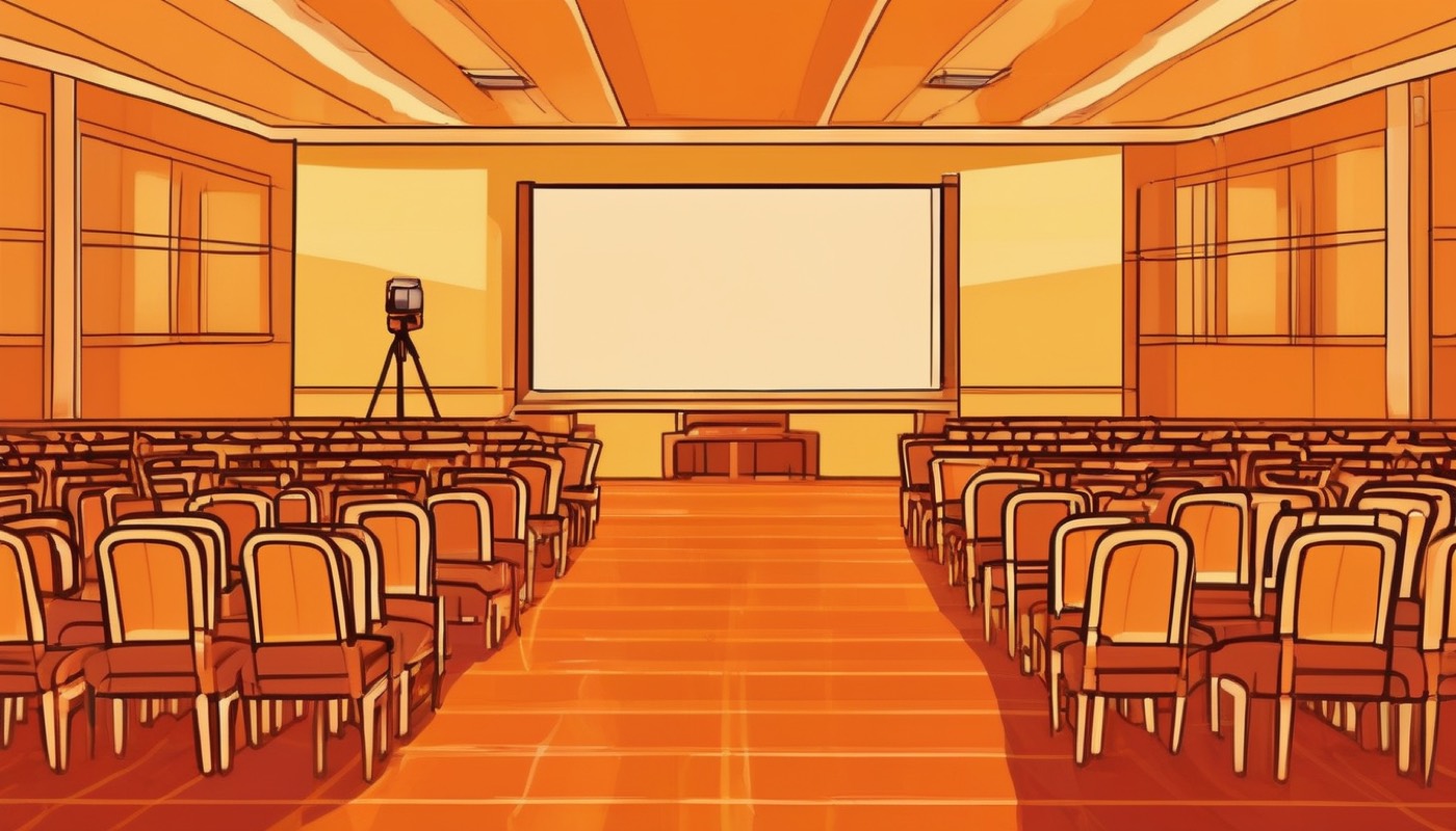
Repetition makes a picture out of things that individually are not pictures: a rank of chairs, a run of windows, a crowd of identical shapes. What the eye gets from repetition is rhythm, and rhythm holds attention for longer than a single object does.
But a perfect pattern is decorative rather than interesting, and the reason is that it has nothing to resolve. The strongest pattern photographs almost always contain a break — one chair facing the other way, one window lit. The pattern then exists to make the break visible, and the break is the subject.
That is worth stating as a general principle, because it recurs: a photograph usually needs something for the viewer to resolve. Complete order and complete chaos are both hard to look at for long.
Reflection gives you symmetry for free, in water, glass and polished stone. Perfect symmetry is formal and can be beautiful; near-symmetry, where one side differs slightly, is usually more interesting, for the reason just given.
Negative space — the empty area around a subject — is the hardest of these to use and the most effective when it works. A small subject in a large empty frame says something specific about isolation or scale, and a large amount of nothing is a positive choice rather than wasted room.
The test is whether the emptiness is doing work. Empty sky above a subject because you did not think about the top of the frame is not negative space; it is an unconsidered edge.
5. 5 Depth

A photograph is flat. Every impression of depth in it is a trick built from cues, and knowing the cues means you can build them deliberately instead of hoping.
The basic structure is foreground, middle ground and background — three layers that the eye can separate. A landscape with only a middle distance reads as a postcard; put something in the near foreground and the same scene acquires a front and a back.
Three cues do the work. Overlap: anything that partly hides something else is in front of it, and this is the strongest depth cue we have. Relative scale: a known object rendered small is read as distant. Atmospheric haze: distant things are paler, lower in contrast and bluer, because there is air between you and them — which is why a photograph taken on a very clear day can look flatter than one taken in slight haze.
Framing within the frame — shooting through an arch, a doorway, branches — is depth and edge-control at once. It puts something at a known near distance, and it hides whatever the frame covers.
And selective focus, from module five, is the cue that photography has and painting had to invent. Throwing the background out of focus separates the layers by sharpness alone. Used carelessly it becomes a substitute for composing; used deliberately it says which layer the picture is about.
6. 6 Balance and visual weight

Some parts of a picture pull attention more strongly than others, and if you know which, you can arrange them instead of discovering afterwards that the viewer looked at the wrong thing.
In rough order of strength: faces first, and it is not close — a human face anywhere in a frame is looked at before anything else, and a face looking at the camera is looked at before a face in profile. Then contrast: a bright area against a dark one, or the reverse. Then saturation: a strongly coloured patch against muted surroundings. Then sharpness, which is why selective focus directs attention as reliably as it does. And finally size, which matters less than people assume — a large dull shape loses to a small bright one every time.
Call the sum of that a subject's visual weight. It has nothing to do with physical size and everything to do with how hard the thing pulls.
Which makes balance a real, usable idea rather than a vague one. A single large element on one side of a frame can be balanced by several small bright ones on the other. A big soft shape can be outweighed by a small face. You are not balancing areas; you are balancing pull.
Tension and rest are the two things you can do with that. A composition where the weights balance is at rest: calm, resolved, stable. One where they do not is in tension: restless, unresolved, and pointing somewhere.
Neither is correct. A portrait of somebody at ease usually wants rest. A photograph of something about to happen usually wants tension. The mistake is to produce either by accident and then wonder why the picture feels the way it does.
7. 7 Colour
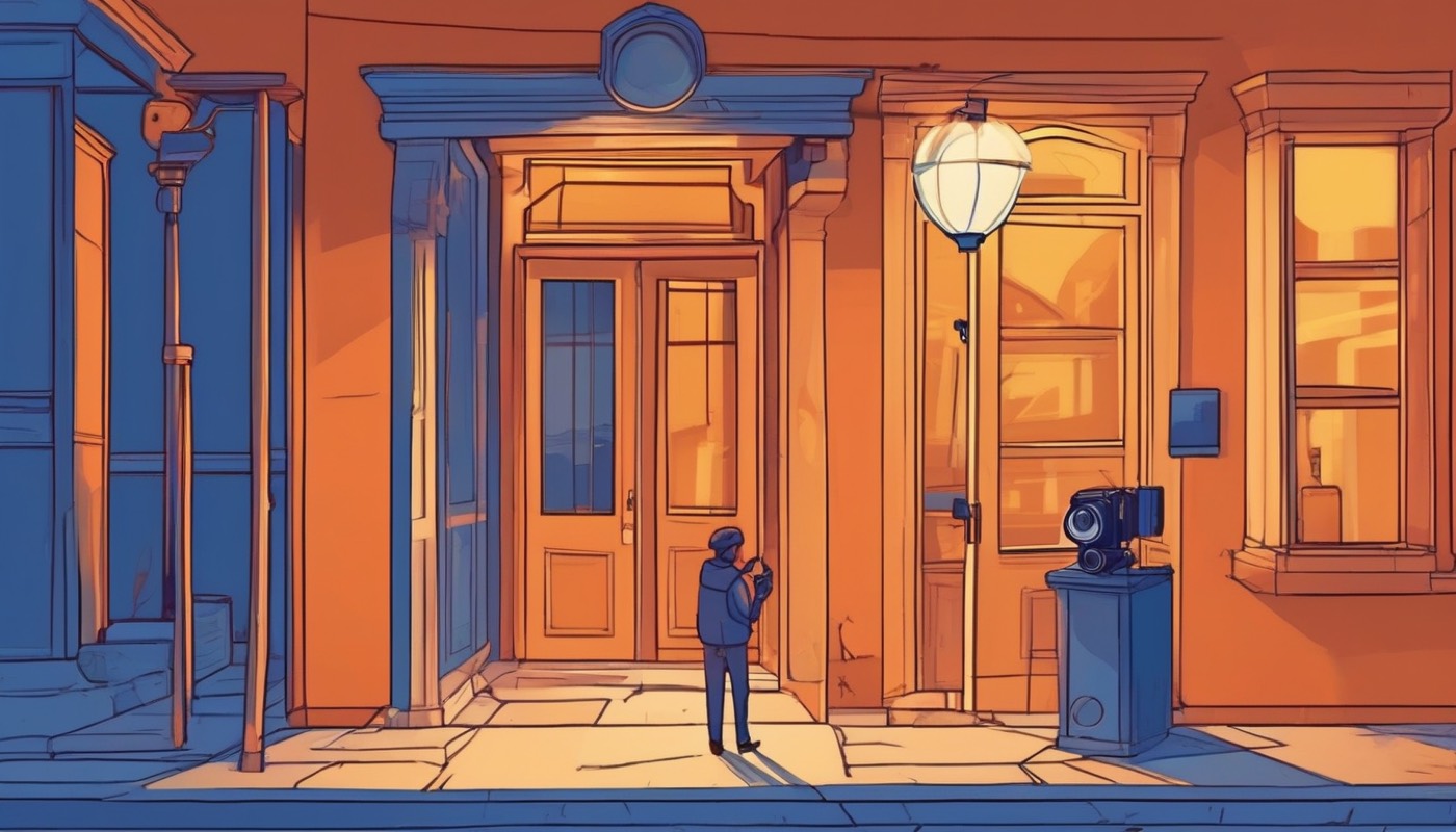
Colour is a compositional element, not a property of the subject, and it can be arranged exactly like line or shape.
Harmony comes from colours near each other — a scene of greens and yellows, or of blues and violets — and reads as calm and coherent. Contrast comes from colours far apart, and the strongest pairs are the ones opposite each other on the colour wheel: blue against orange, which is why a warm-lit subject against a blue dusk sky is such a durable combination.
Then the observation that makes colour spatial. Warm colours advance and cool colours recede. A red object in a scene comes forward; a blue distance falls back. That is an observation about how people read pictures rather than a law of optics — but it lines up with the atmospheric haze of the last chapter, where distance genuinely does turn things blue, and the two reinforce each other.
The practical consequence: a warm subject against a cool background gets separation for nothing. A cool subject against a warm background has to earn it some other way.
Restricting the palette is the single most effective colour technique and it is subtractive. A photograph containing three colours is almost always stronger than one containing nine, and the way to get there is usually not editing but the same move as everything else in this module — changing where you stand until the extra colours fall outside the frame.
And removing colour altogether. Black and white is not an old-fashioned version of a colour photograph; it is a different set of materials. It removes the strongest attention-getter after faces, which means tone, shape, line and texture have to carry the picture alone. Convert an image that depends on a red coat and you get nothing. Convert one that depends on a shaft of light across a face and it often gets stronger.
The honest test: if the colour is the subject, keep it. If the colour is a distraction from the subject, that is the case for removing it — not because monochrome is more serious.
8. 8 Simplifying

Almost every failed photograph fails the same way. It contains too much.
The oldest advice in photography is to get closer, usually attributed to a war photographer and repeated ever since. What it actually means is not "use a longer lens" — module five settled that, and a longer lens from the same spot only crops. It means move your feet, so that the things that were not contributing fall outside the edges.
Getting closer is the first tool. The others are the same instinct applied differently.
Change height. Almost everybody photographs from standing eye level, because that is where their eyes are. Crouch and the background changes completely — a cluttered street becomes sky. Climb two steps and a crowd separates into individuals. Height is the cheapest and least used control in photography.
Change the angle. Move a few paces left and the pylon goes behind the tree. This is the same operation as getting closer: you are moving the background relative to the subject, and the background is where most of the clutter lives.
Wait. This is a compositional technique and it is barely ever taught as one. The light moves. The crowd thins. A person walks into the empty space on the left that the picture needed. Setting a frame you like and waiting in it for the missing element is how a large fraction of good photographs are actually made — the frame is decided first and the moment fills it.
And the hardest one: knowing when the picture is not there. Some scenes cannot be composed. The elements will not simplify, the background will not clear, the light is doing nothing. Recognising that quickly and walking on is a skill, and it is the opposite of the instinct to photograph harder.
9. 9 Seeing

Everything so far has been arrangement. This last chapter is about what you are arranging, and it is the part that cannot be reduced to a technique.
Here is the distinction that matters. There is a photograph of a thing, and there is a photograph about something.
A photograph of a cathedral records a cathedral: it is accurate, and a thousand people took it this year. A photograph about the scale of a cathedral might contain a small figure in a doorway and no roof at all. The first is a description. The second has a point of view, and everything in this module is the machinery for expressing one.
The way you find out which you have is to work the subject. Take the obvious frame first, so that it is out of your system. Then move. Get lower. Go round the back. Take the detail instead of the whole. Twenty frames of one subject, and among them there will usually be one that is about something rather than merely of something — and it is very rarely the first.
Then editing, which is part of seeing rather than something that happens afterwards. Choosing which of the twenty is the picture is the same act of judgement as taking it, done more slowly. Photographers who improve quickly are almost always the ones who are ruthless here: a good edit of a mediocre shoot beats a loose edit of a good one.
Leave time before you edit, incidentally. The frame you remember enjoying taking is not reliably the frame that works, and a few days is usually enough to break the association.
Finally, the thing everybody wants and nobody can be given: an eye of your own.
It is built by looking, not by shooting. Look at photographs — a lot of them, including old ones, including ones you do not like — and work out what each photographer decided. Not what equipment they used, which does not matter; what they chose to include, where they stood, what they waited for.
Copy deliberately while you learn, the way musicians learn other people's pieces, and then stop. What survives from that period is not the imitation but the vocabulary, and the vocabulary is what you compose with for the rest of your life.
The conventions in this module are a hundred and fifty years of other photographers' notes. Use them as notes. The picture is still yours to decide.
Sources and credits
Primary sources
- George Markowsky, 'Misconceptions about the Golden Ratio', The College Mathematics Journal, Mathematical Association of America, January 1992. — the module says the claims are contested and attributes the objection, and does not quote the paper.
Not regulated financial advice.